Wii Remote UI for Windows Media Player
This was a project for an elective course called Human-Computer Interaction. Each group chose a specific use case that failed or needed improvement and then implemented a solution to the identified issues. My partner and I wanted to improve the "10-foot" experience of Windows Media Player on a big screen television.
Informal interviews with our classmates and friends led us to two main problem areas:
- It is too hard to quickly determine where the mouse is because of its small size and the long viewing distance, and
- The playback controls are too hard to hit accurately because of their small size.
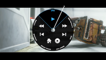
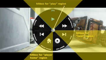
We created a new user interface layer that rectified these two problems. Our design turns each circular button into a large pie shaped region of infinite size. Each button is activated when the white line crosses the button, allowing the pointer to be in an infinitely-sized region that extends off the screen. We harness the power of Fitt's Law to make each button very easy to hit, even from the sofa.
The white line extending from the center of the pie also serves to increase the visibility of the mouse pointer itself. Even if you can't tell its exact position, you can always see the region of the screen, which is enough information to effectively use our new UI.
Formal testing of the new user interface showed a 52% decrease in the amount of time it took the tester to invoke any command from the menu compared to the original Media Center controls.


